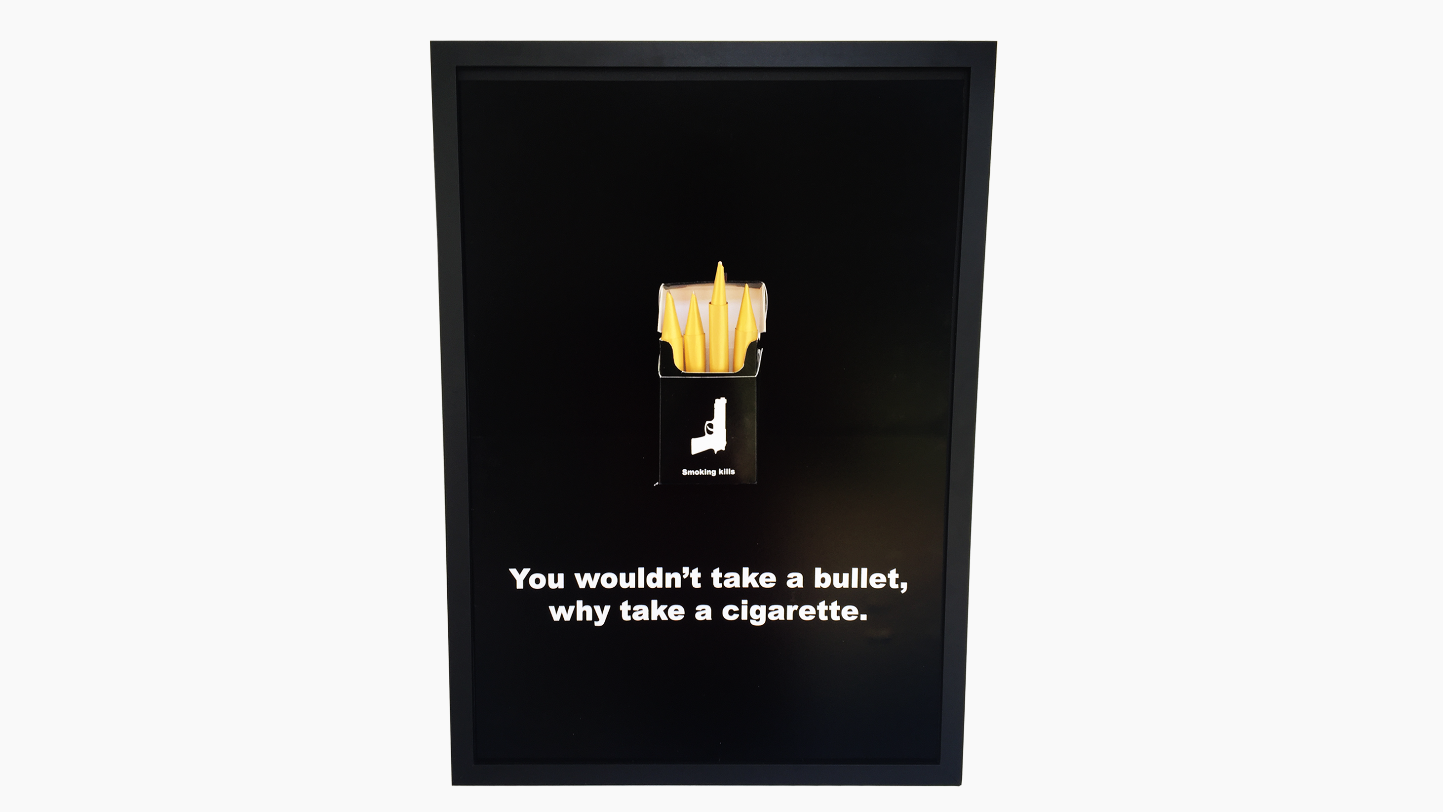

Typeface Creation
From scratch, making consistent, unique typefaces.
Typeface Creation
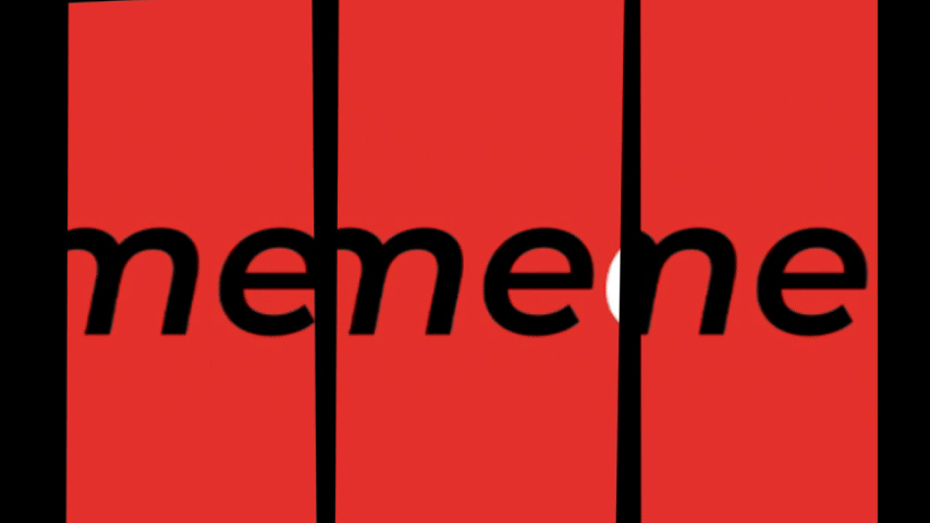
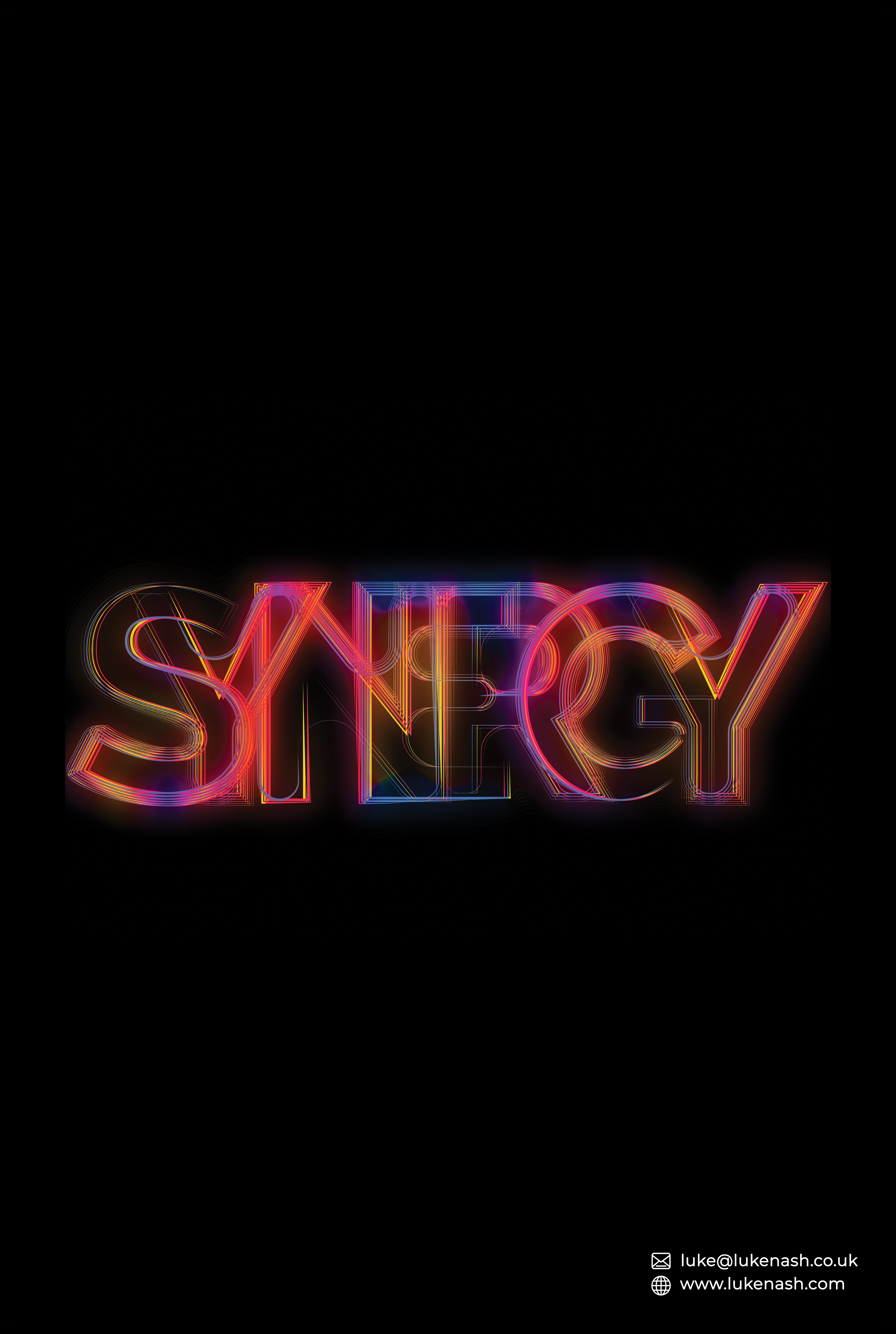
1. SYNERGY
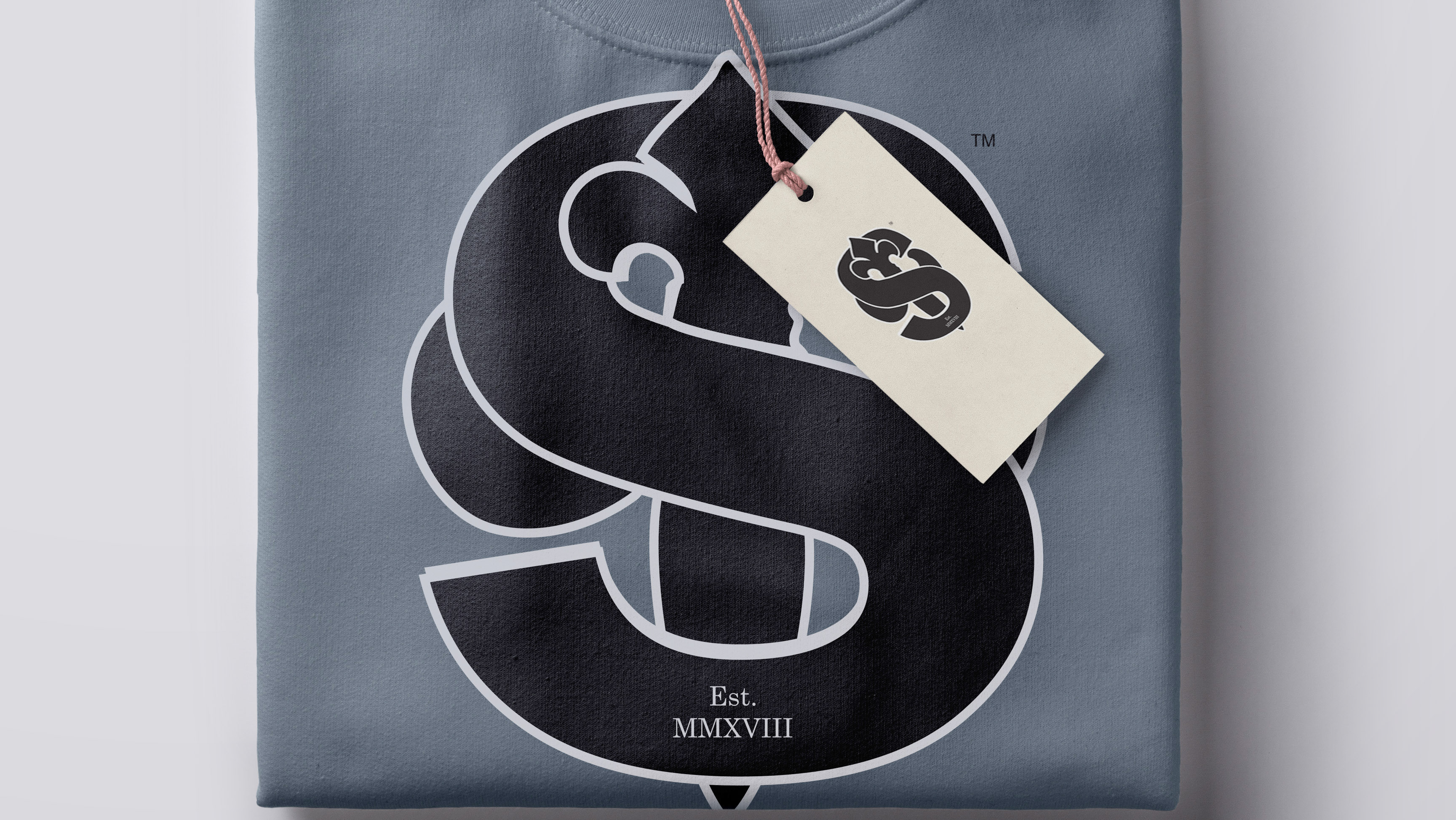
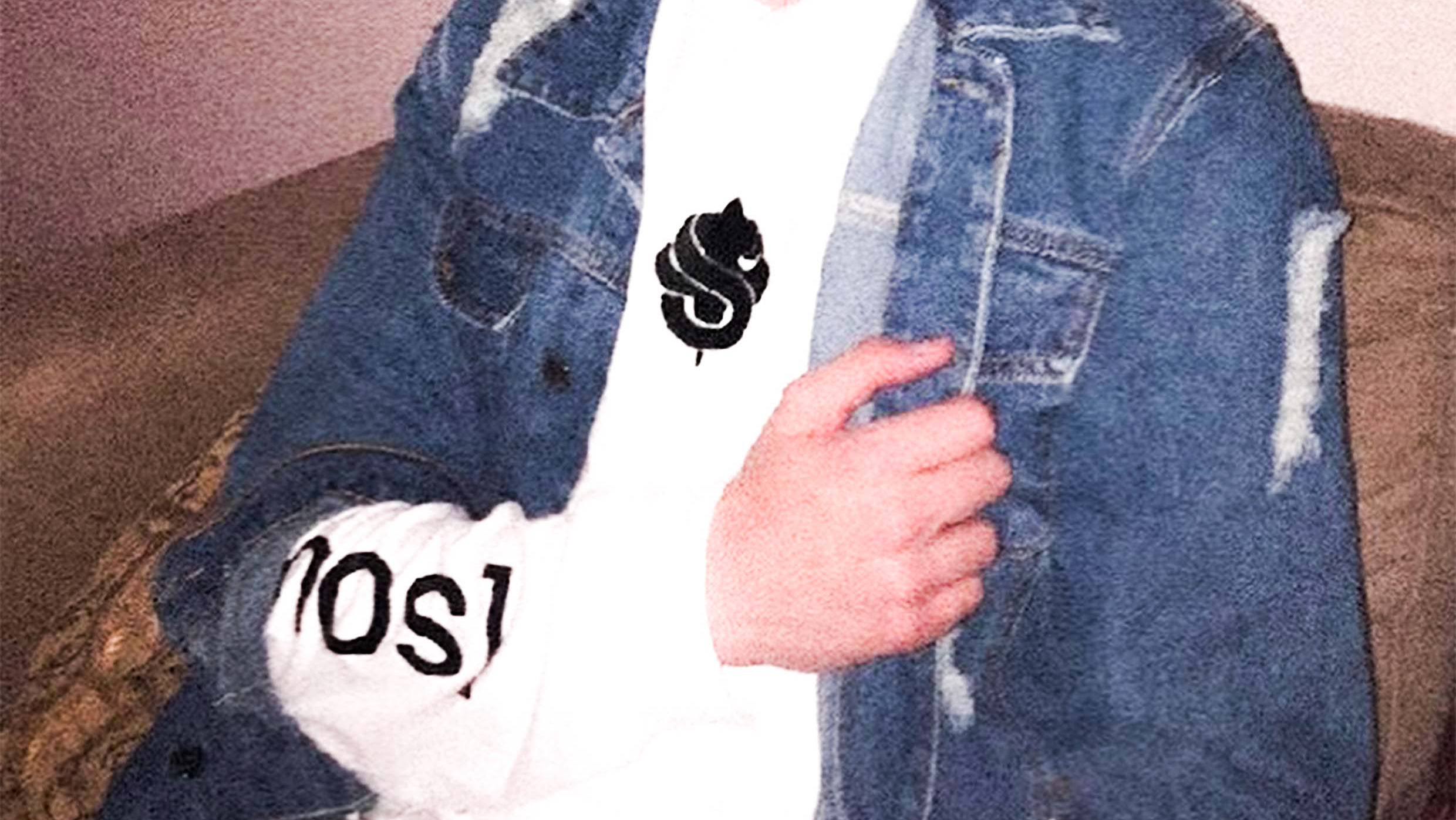
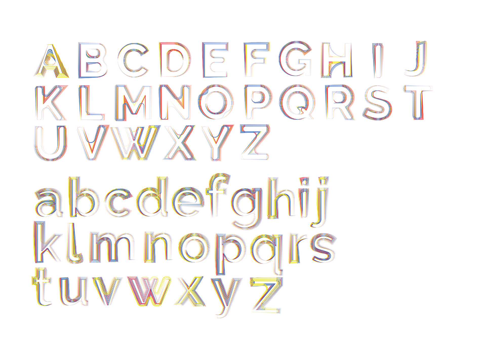
This is Synergy.
Synergy is a typeface I created based off of the condition Synaesthesia, which with extensive research, is through having one sense unlock another e.g. Visualising what sound looks like.
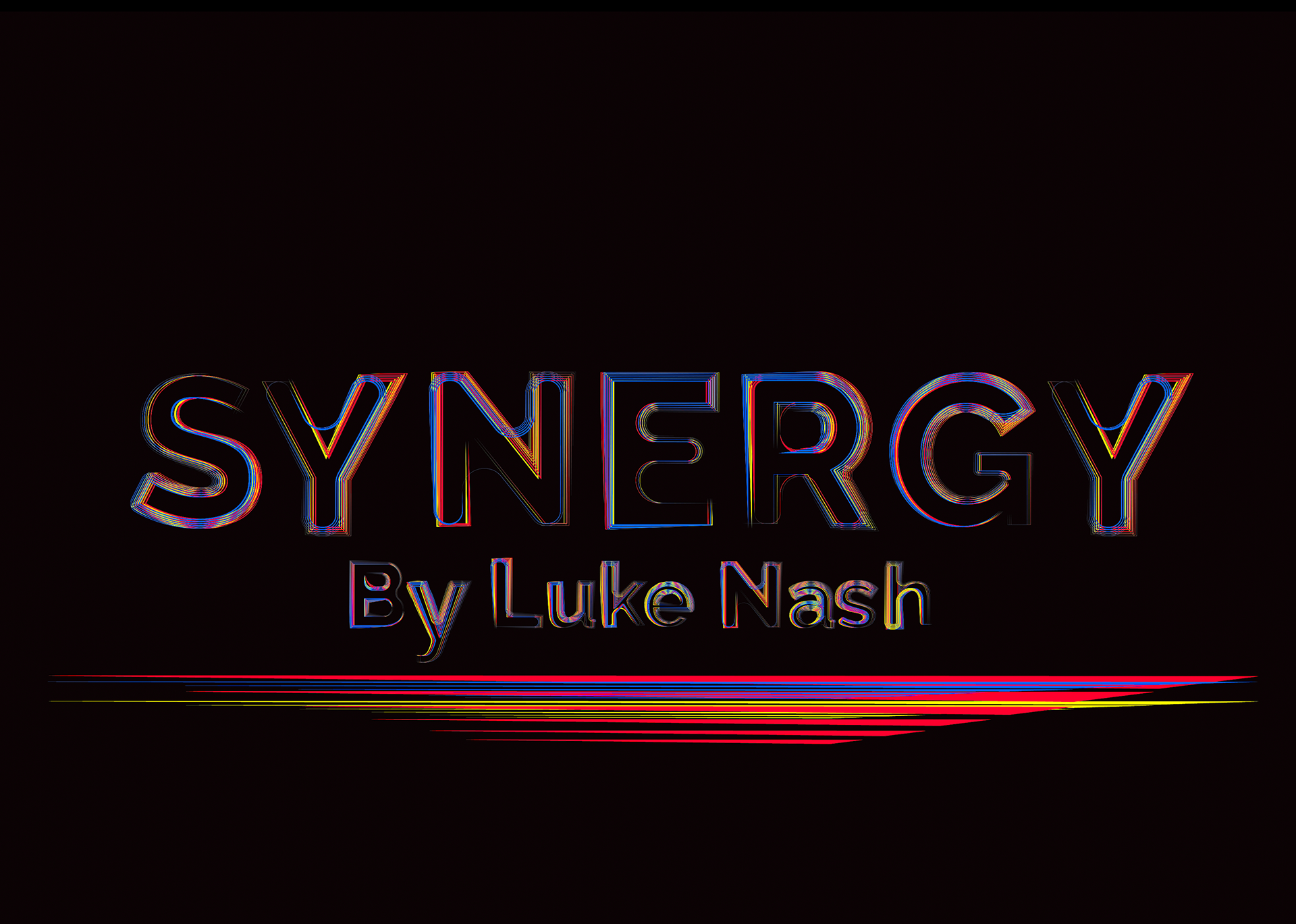
I put this to the test with this typeface creation.
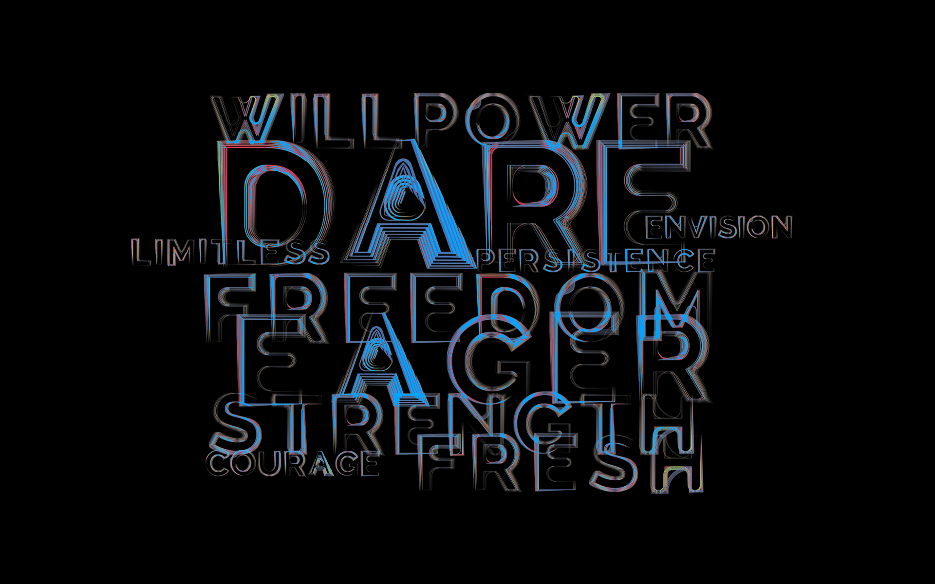
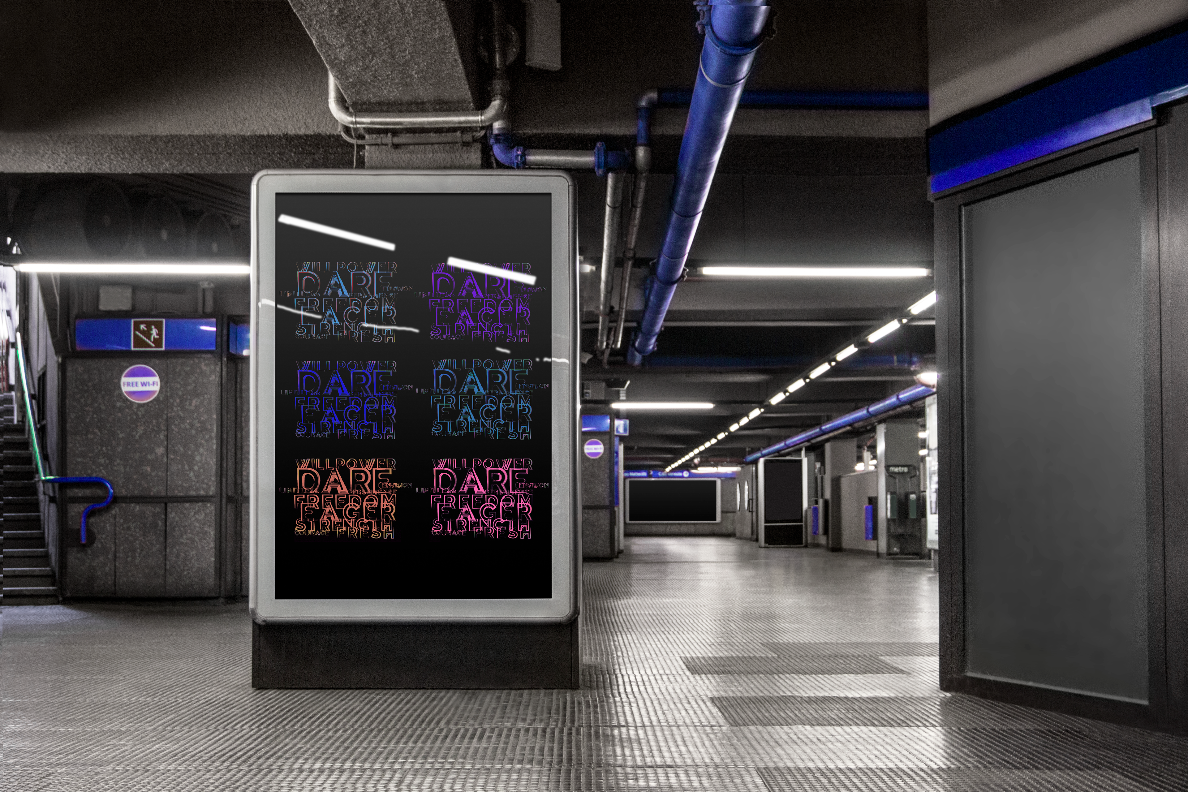
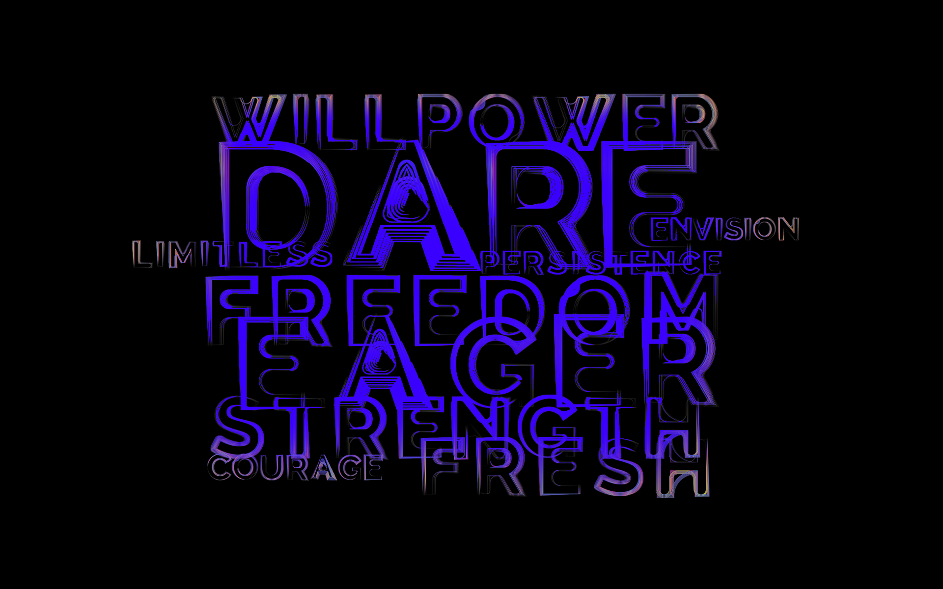
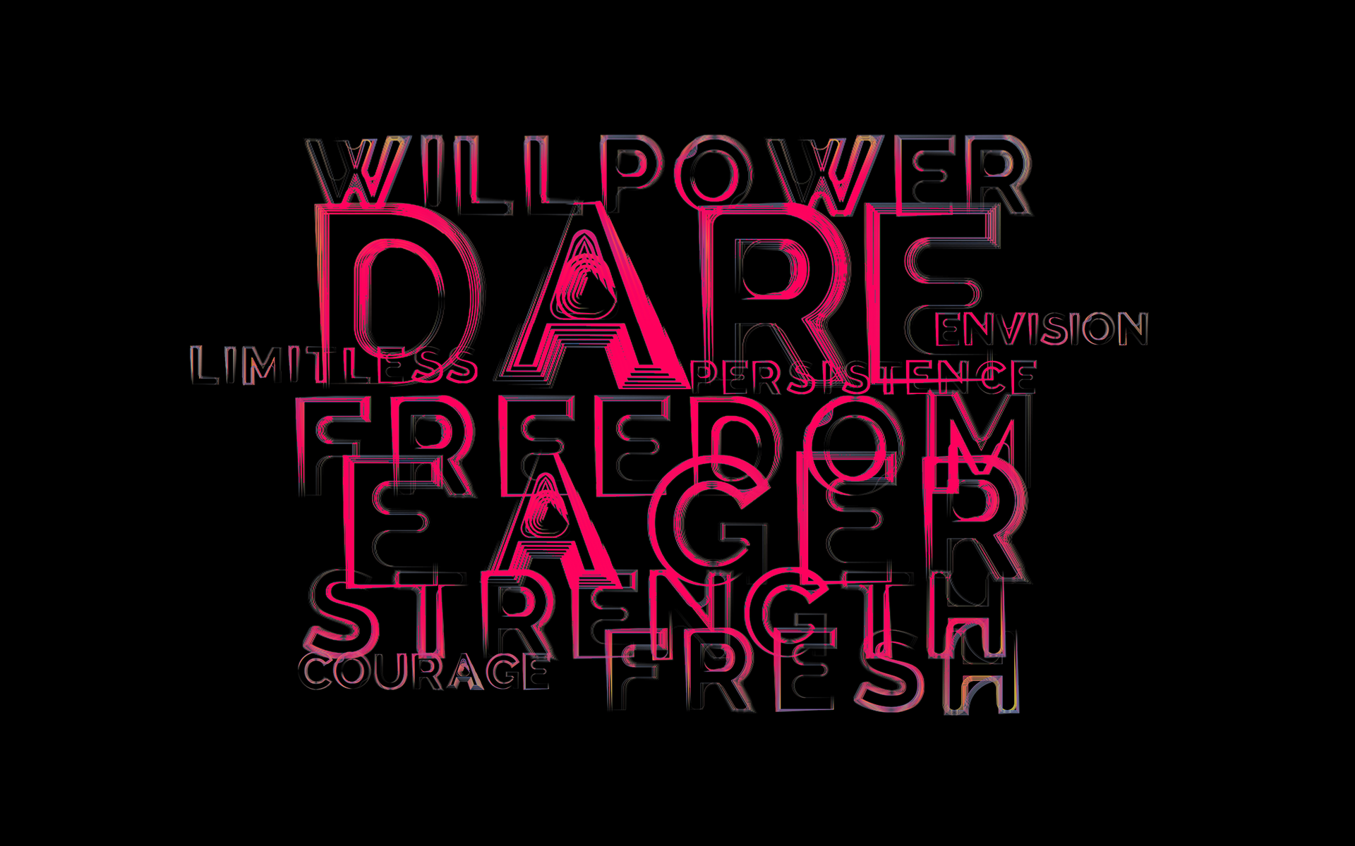
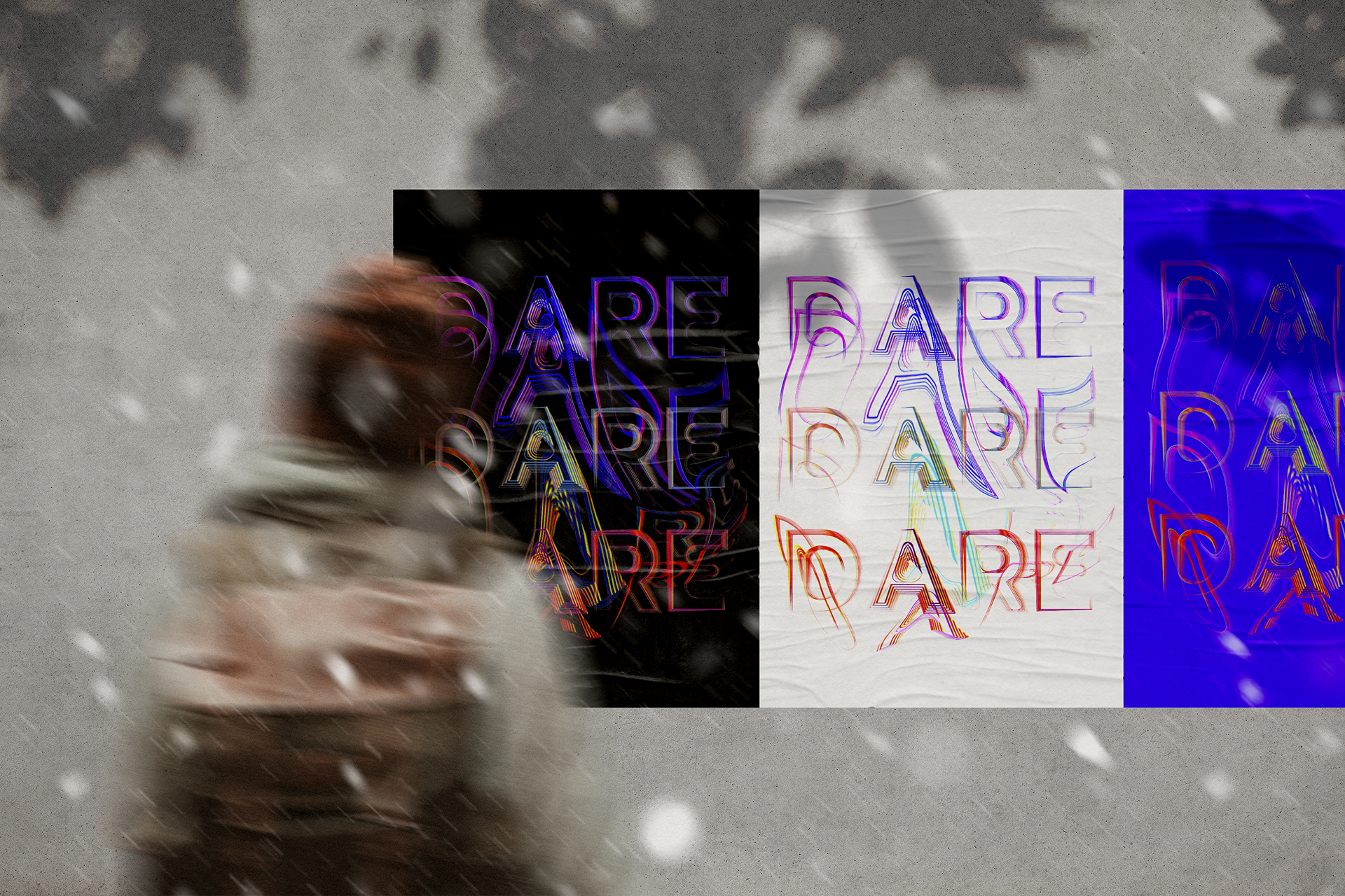
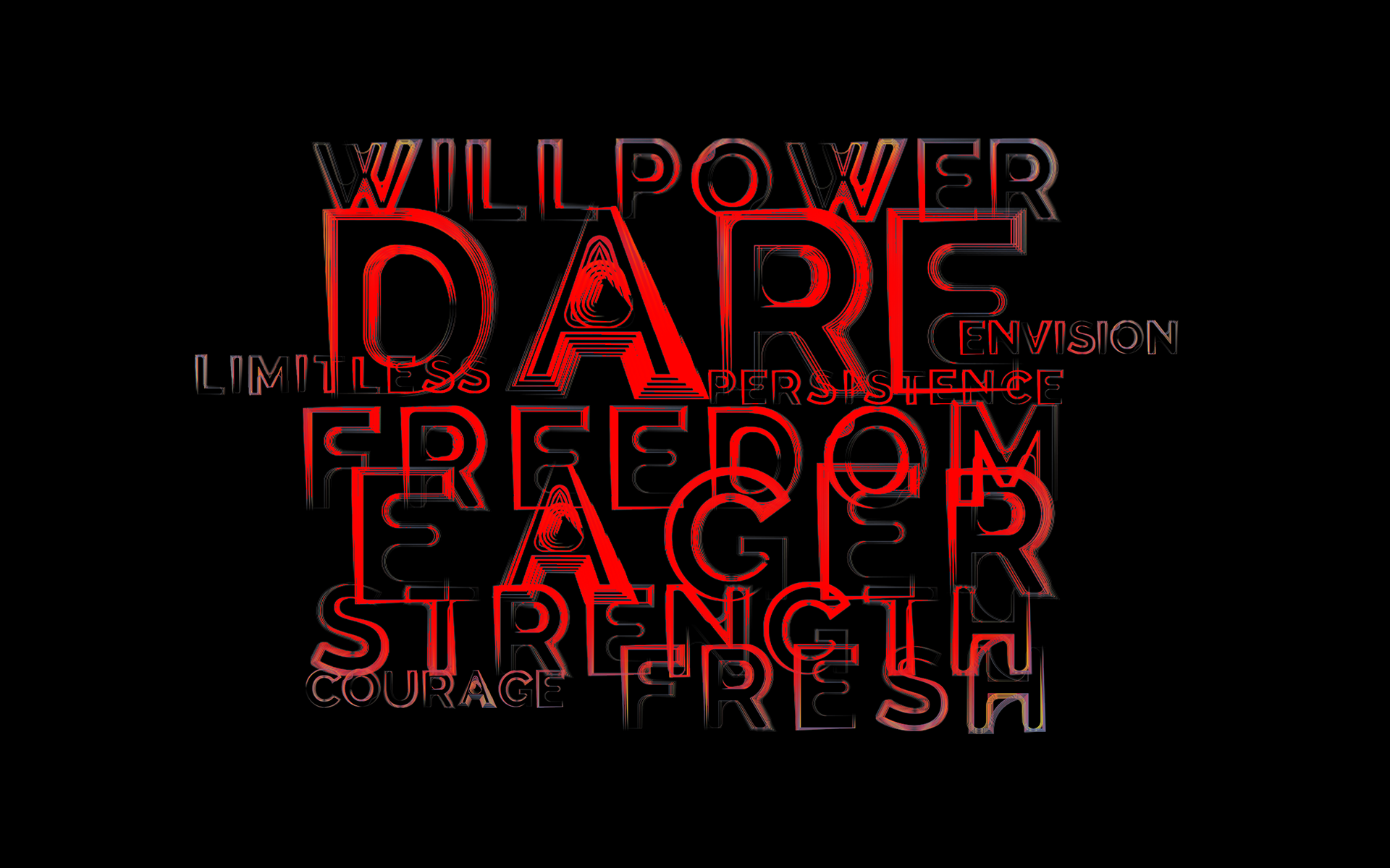
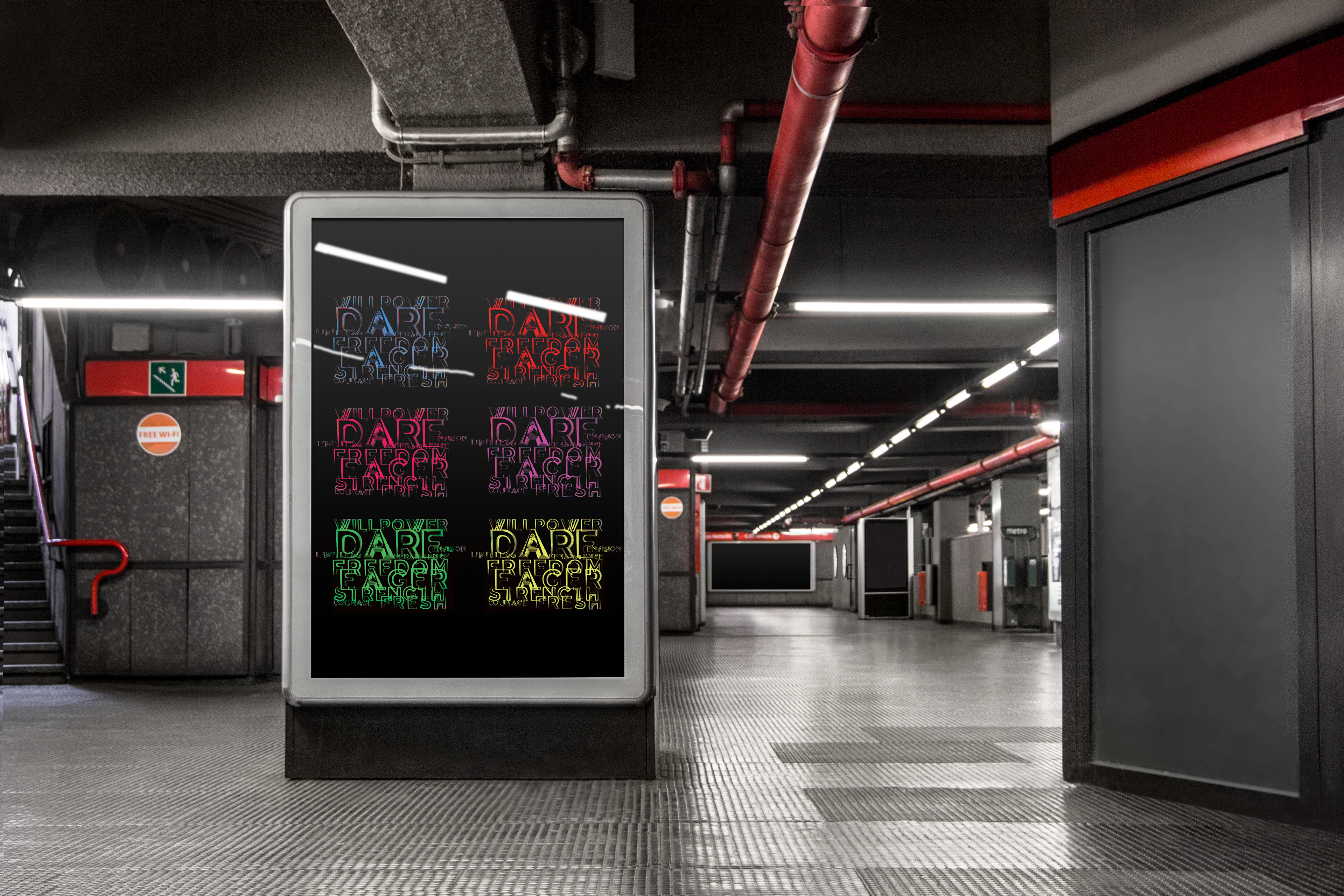
Synergy is visual representation typeface based off how I hear trains.
I often travel by train from home to university and when listening whether I'm waiting or I'm in one, this is the visual outcome of those sounds. Based off trail light photography it breathes energy, connection and opportunity moving at speed from one place to another.
Synergy's definition is two businesses coming together to use their individual brilliance to create something even better. With this typeface, the meaning is using two human senses to create something better than you would using just one.
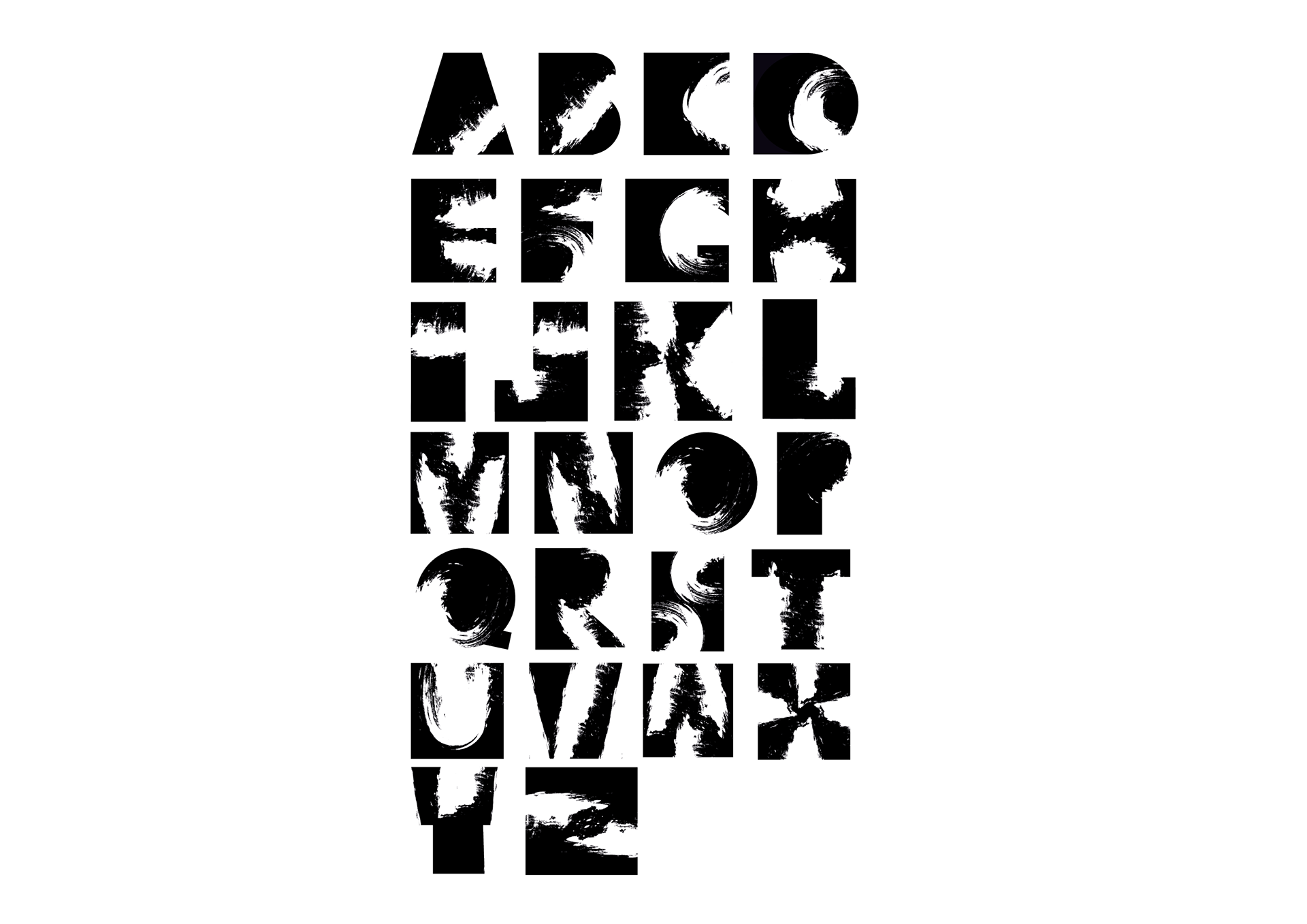
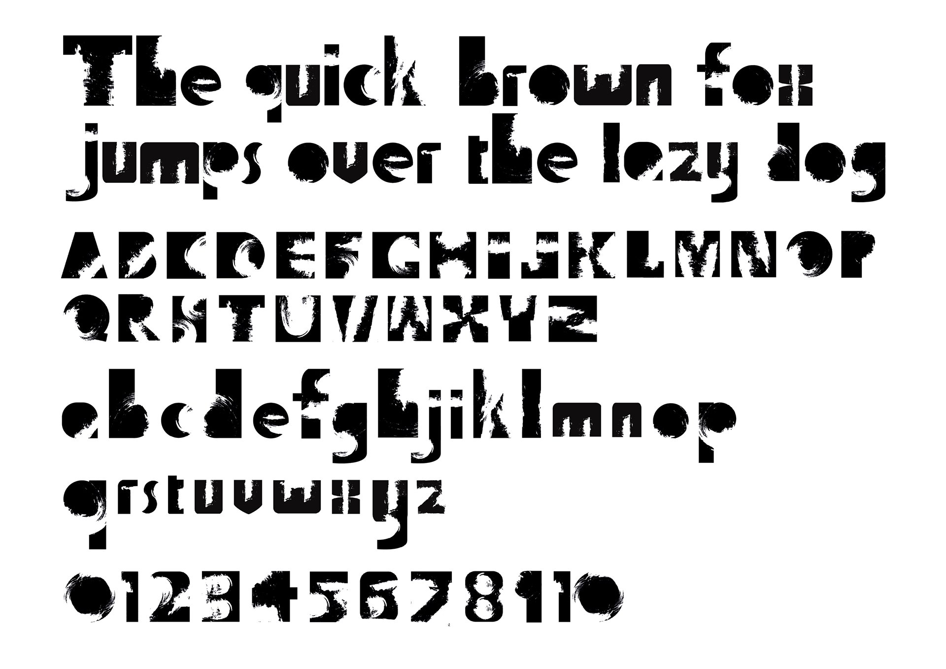
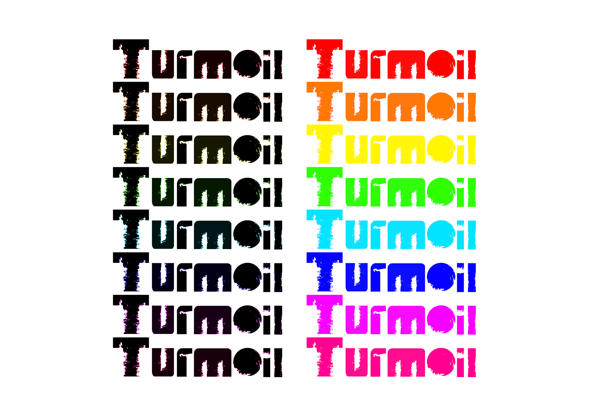
2. TURNMOIL
Typeface that was created in my first year of university alongside Synergy. Both learning and testing my abilities to create a new type.
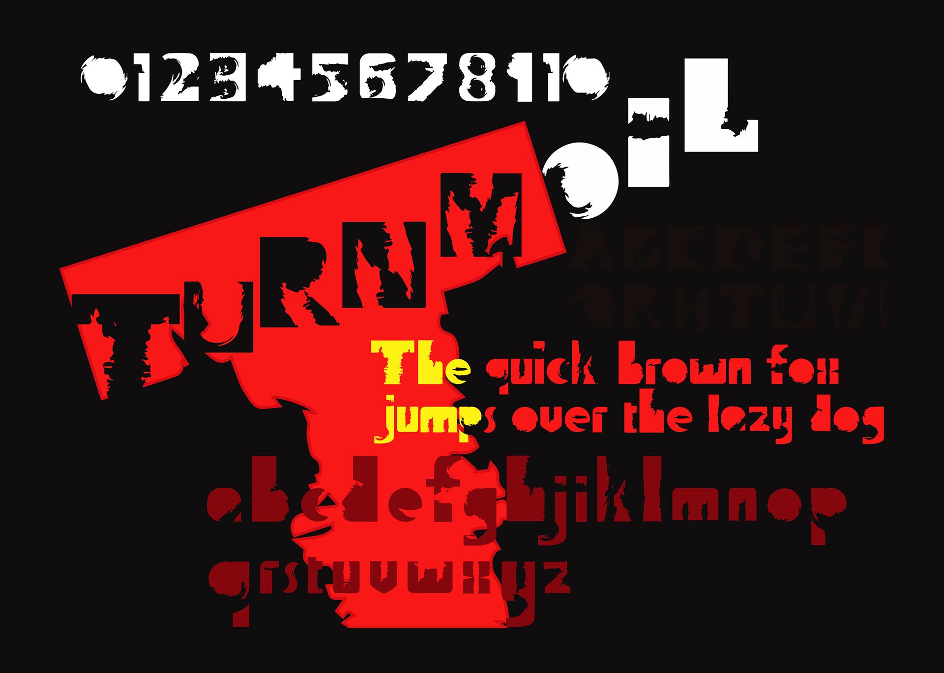
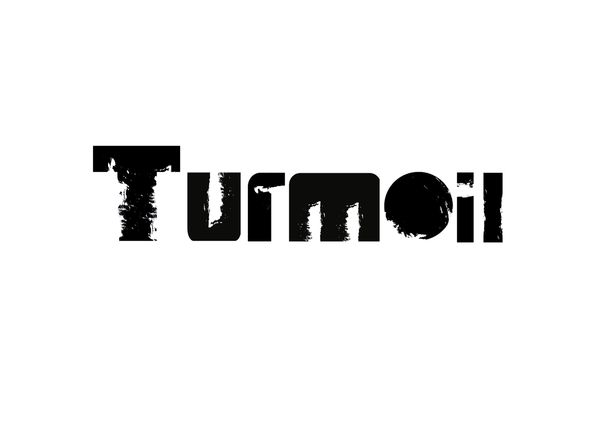
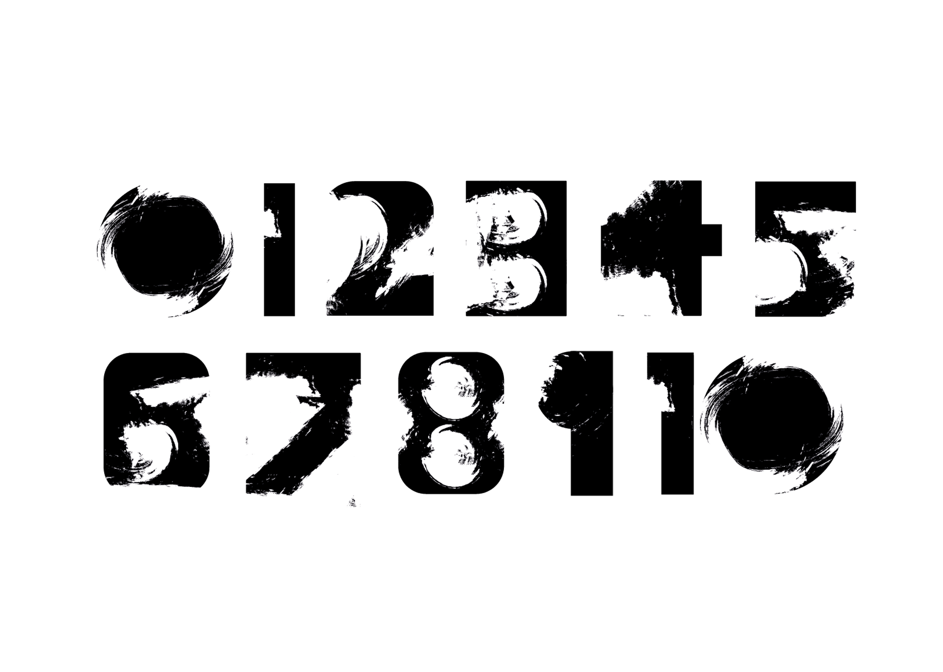
The development of Turmoil started off with black shapes.
I then added a white brush stroke which defines the letter in a distorted manor giving it the rough look it possesses.
I then added a white brush stroke which defines the letter in a distorted manor giving it the rough look it possesses.