
My Blogs
From design to marketing. My passion & enjoyment goes beyond visual identity. It's communicating this through blogs & articles. Here, you'll find just that.
Stand out
In a crowded visual landscape the most memorable work doesn’t just catch the eye, it evokes feeling. Whether it’s the bold simplicity of a brand mark or the layered nuance of a brand identity, the best design doesn’t stop at aesthetics.
On my site you’ll find examples where I’ve aimed to do exactly that: branding that doesn’t just look good, but speaks to the audience, sparks emotion and sets a tone for years to come.
Stand‑out design is less about being loud and more about being purposeful. It’s about clarity without oversimplification, emotion without gimmick. When design has something to say and says it well, the result resonates. That’s the kind of work I aim to deliver.
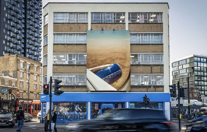
British Airways
Campaign
To save you time, it's authentic and real. That, in a nutshell,
sums up the campaign.
But for those who want to stick around...
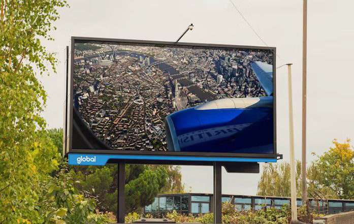
As a creative, I’m always drawn to brands that say more by doing less. British Airways’ latest campaign, Reflections, is a standout in restraint, curation, and concept led thinking. It’s a reminder that great creative doesn’t need to shout. Sometimes, all it needs is a seat by the window.
Framing the World Differently...
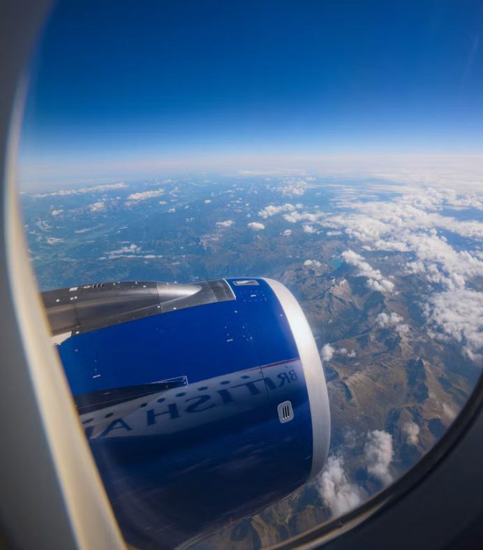
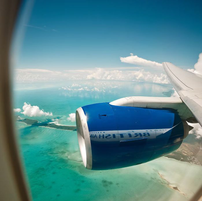
In partnership with Uncommon Creative Studio, British Airways handed four photographers a brief as open as the skies they flew through: Capture the world from your plane window. That’s it. No exotic shoot locations. No camera rigs. Just real travel, real routes, and creative instincts. The result is a set of cinematic, contemplative images where the only consistent element is the curve of an aircraft window. Every shot is a reflection of a place, a time, a fleeting emotion caught mid air.
sums up the campaign.
But for those who want to stick around...
As a creative, I’m always drawn to brands that say more by doing less. British Airways’ latest campaign, Reflections, is a standout in restraint, curation, and concept led thinking. It’s a reminder that great creative doesn’t need to shout. Sometimes, all it needs is a seat by the window.
Framing the World Differently...
In partnership with Uncommon Creative Studio, British Airways handed four photographers a brief as open as the skies they flew through: Capture the world from your plane window. That’s it. No exotic shoot locations. No camera rigs. Just real travel, real routes, and creative instincts. The result is a set of cinematic, contemplative images where the only consistent element is the curve of an aircraft window. Every shot is a reflection of a place, a time, a fleeting emotion caught mid air.
Is the Creativity ‘All That’?...
The campaign is concept driven, not copy led. No dense taglines. No overlaid calls to action. It trusts the image to carry the story. That takes creative confidence.
Branding is in the background, literally. The British Airways logo appears only as a reflection on the engine cowling. Sometimes backwards. Sometimes barely visible. It whispers premium without shouting. The window frame becomes a brand device. Repeated across images, it creates visual consistency without ever feeling templated. It’s recognisable without being obvious.
It’s rooted in a real lived experience. Anyone who’s flown knows the feeling of gazing out, watching the world shrink. The campaign captures that moment and turns it into a gallery.
A Final Thought...
Reflections is a raw reminder that some of the best design work happens when we stop trying to control every element and instead focus on the frame. What makes this campaign soar is not just where the photographers went, but how they saw it. And how the brand trusted them enough to show us.
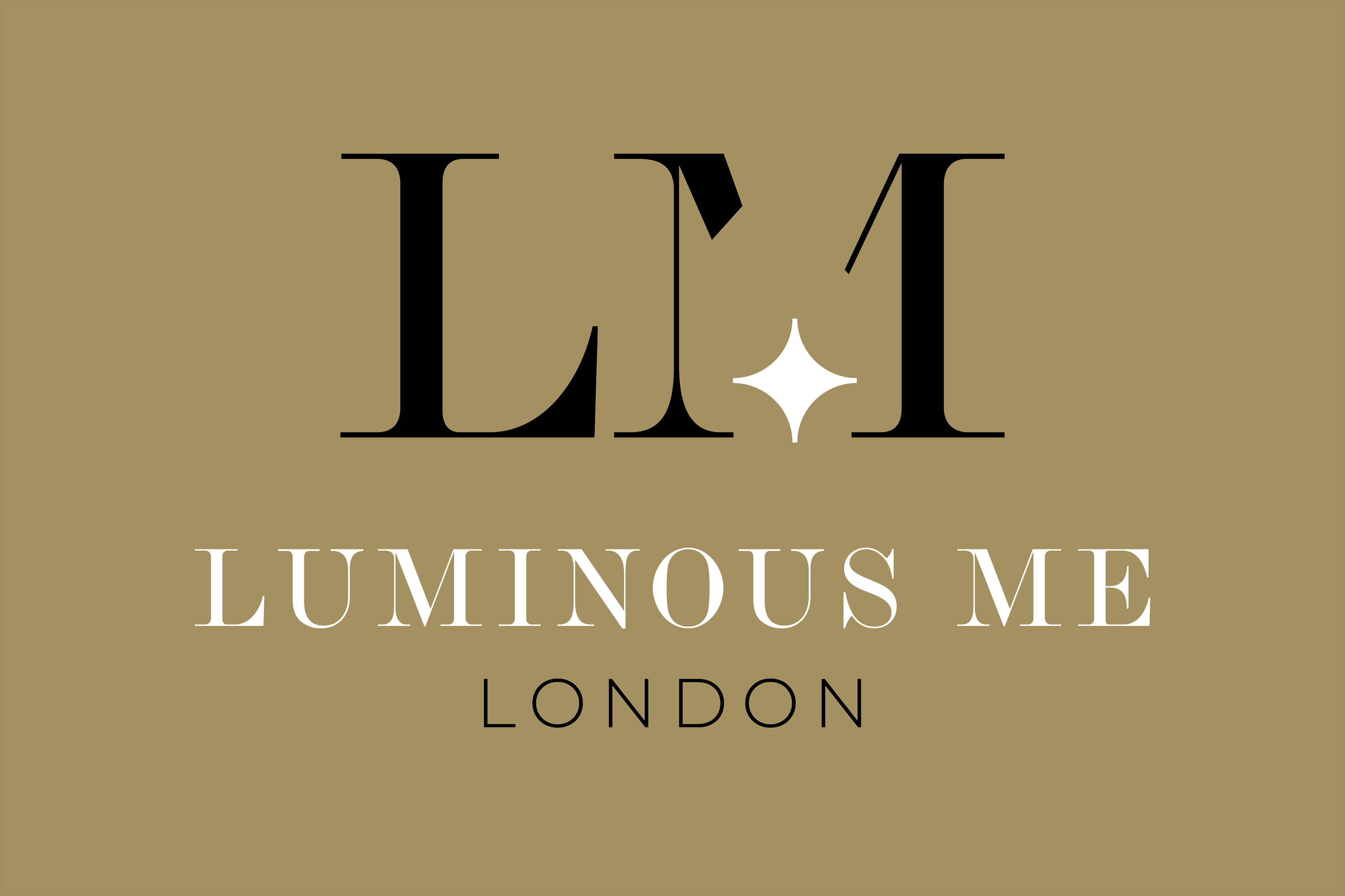
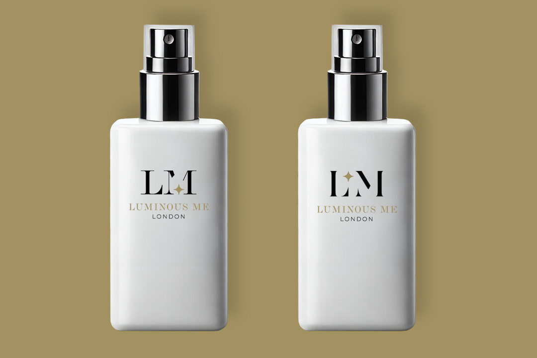
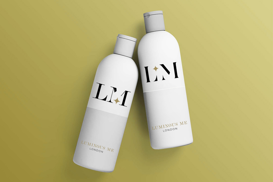
Luminous Me
There's something about the skincare & cosmetic world that I'm invested in. It's the communication from brand identity that reflects the product. Soft, glow, health, premium, a must have.
✨ Luminous Me Branding & Logo Generation.
Luminous Me, a 'bright or shining glow' for me was a vital component that was screaming to be represented. The minimal, yet premium look of L.M supported with the star to assure this business was consistent in it's purpose from branding, to the product itself.