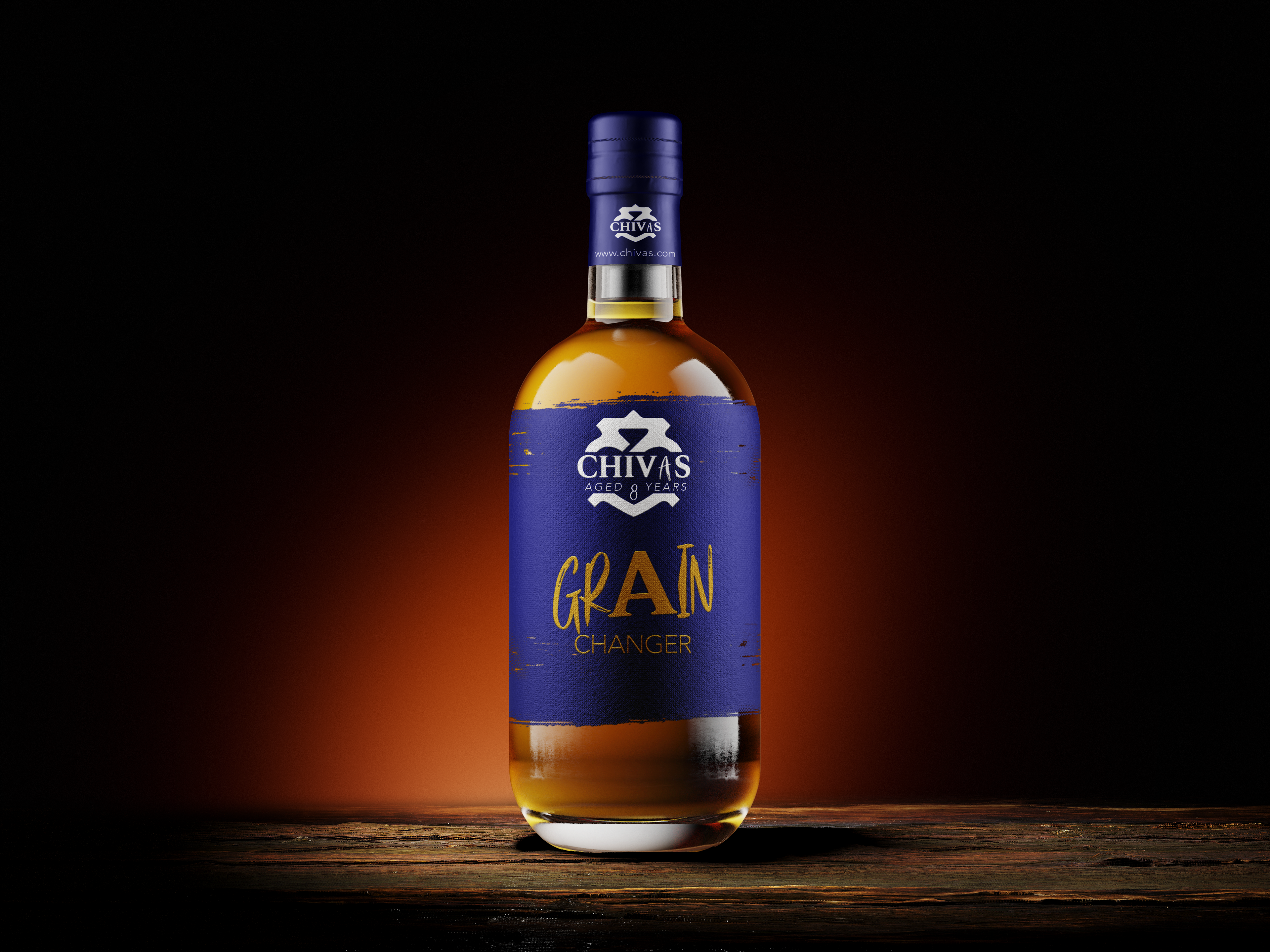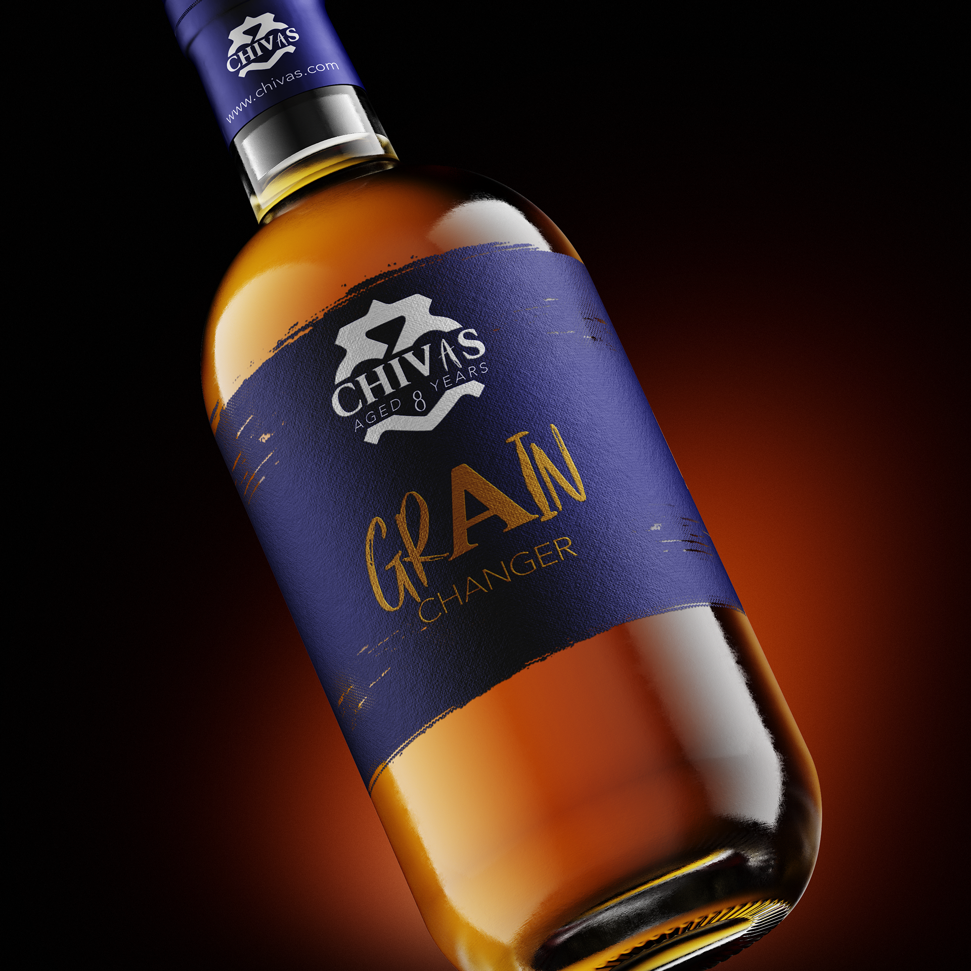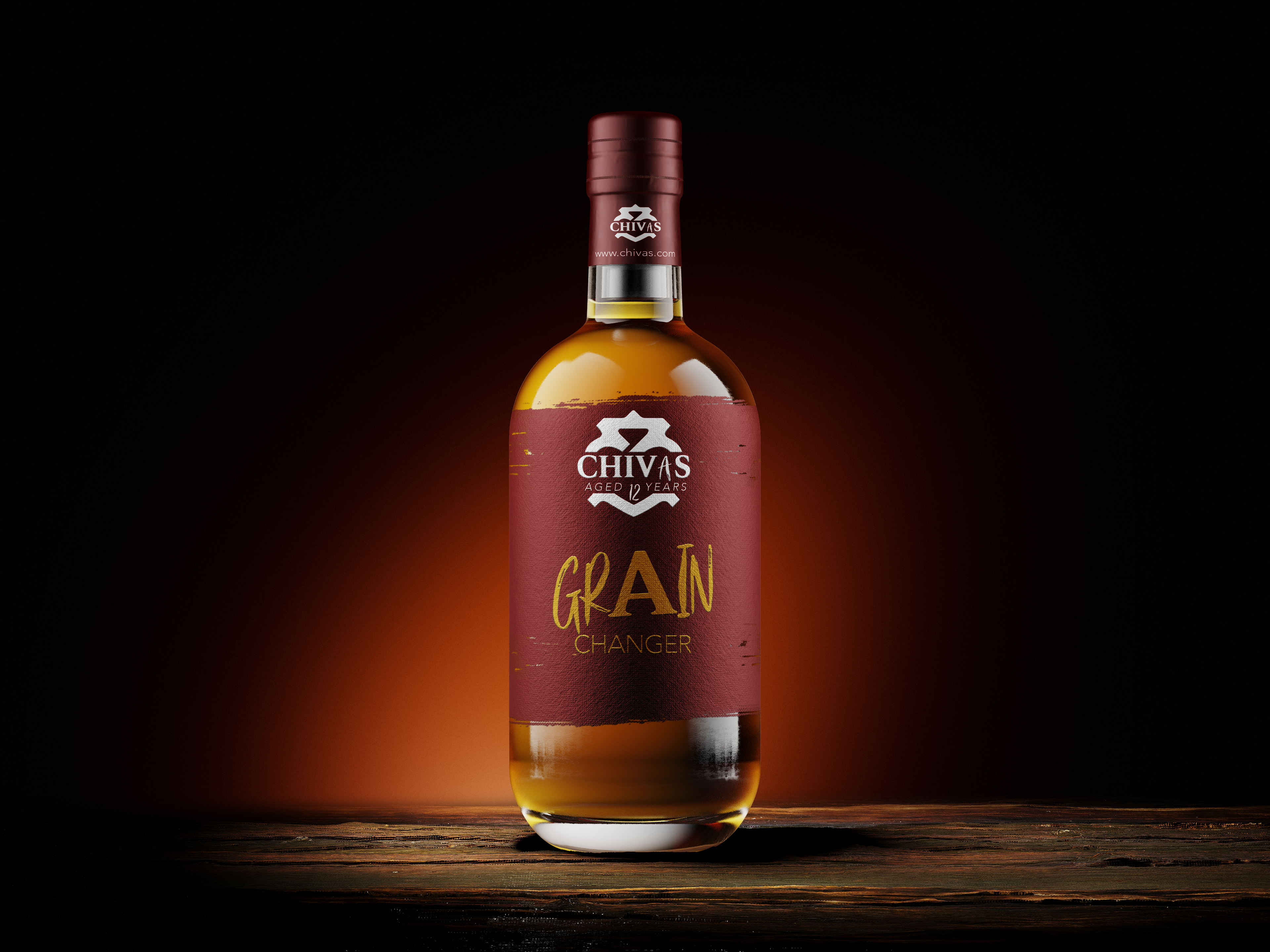
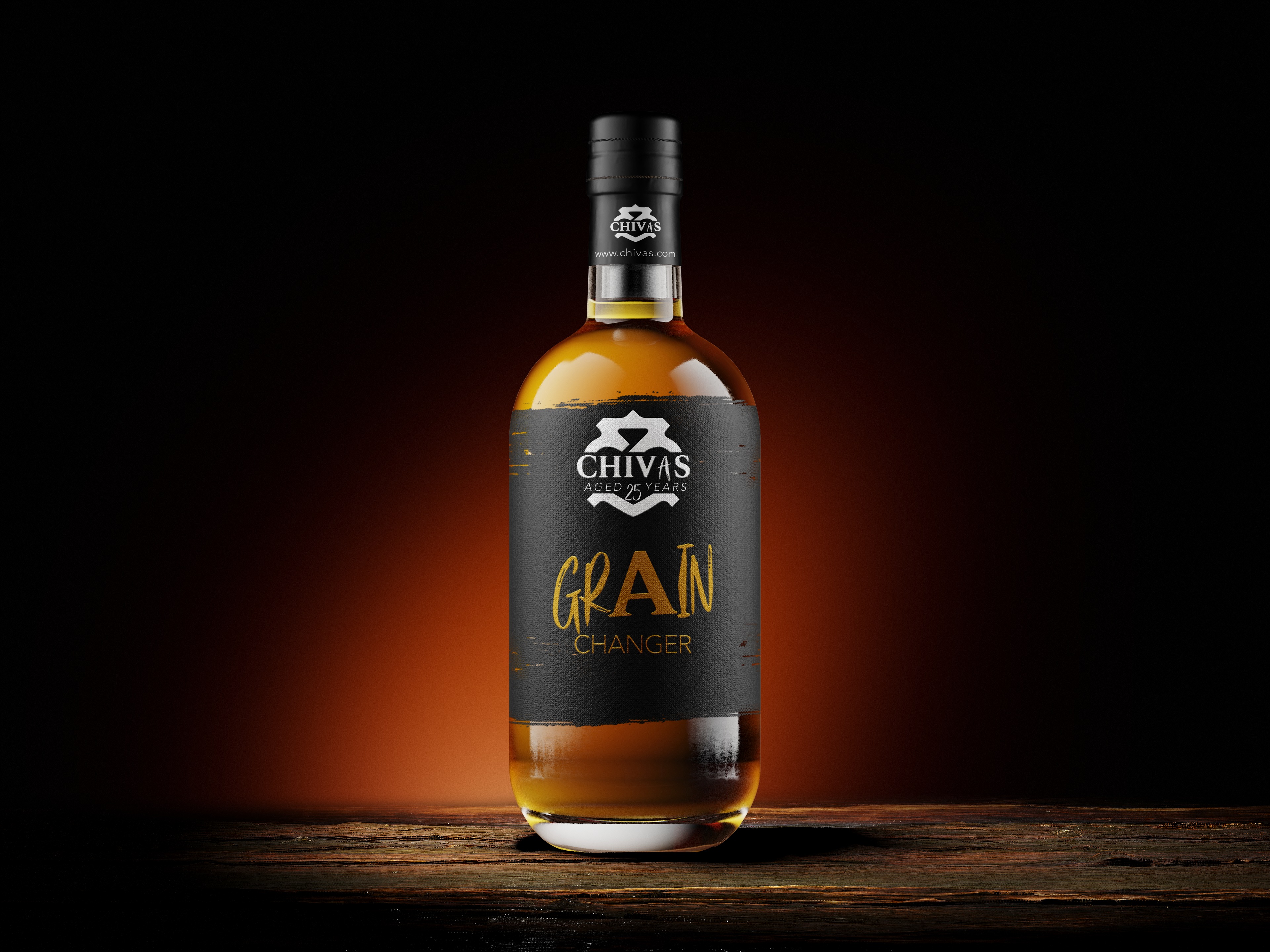
CHIVAS. An established liquor company that was founded in 1786. Whilst whiskey has been a popular drink for many centuries. CHIVAS wanted to change the look of their bottle designs to fit the new age of whiskey lovers.
After extensive research on whiskey, the designs the bottles have worn over the many years, I knew if the look was to be reinvented for the new, I had to reinvent the logo of CHIVAS to fit that.
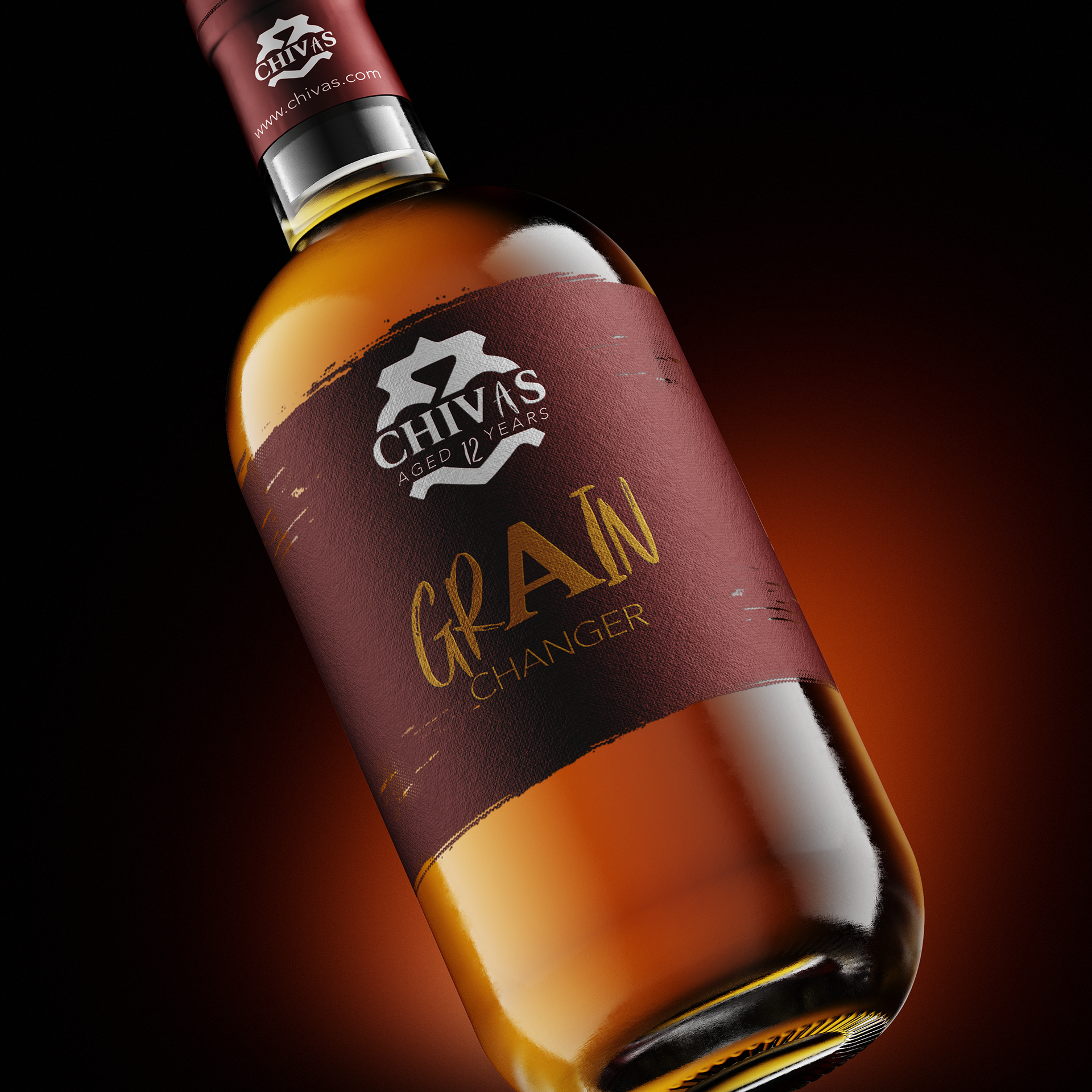
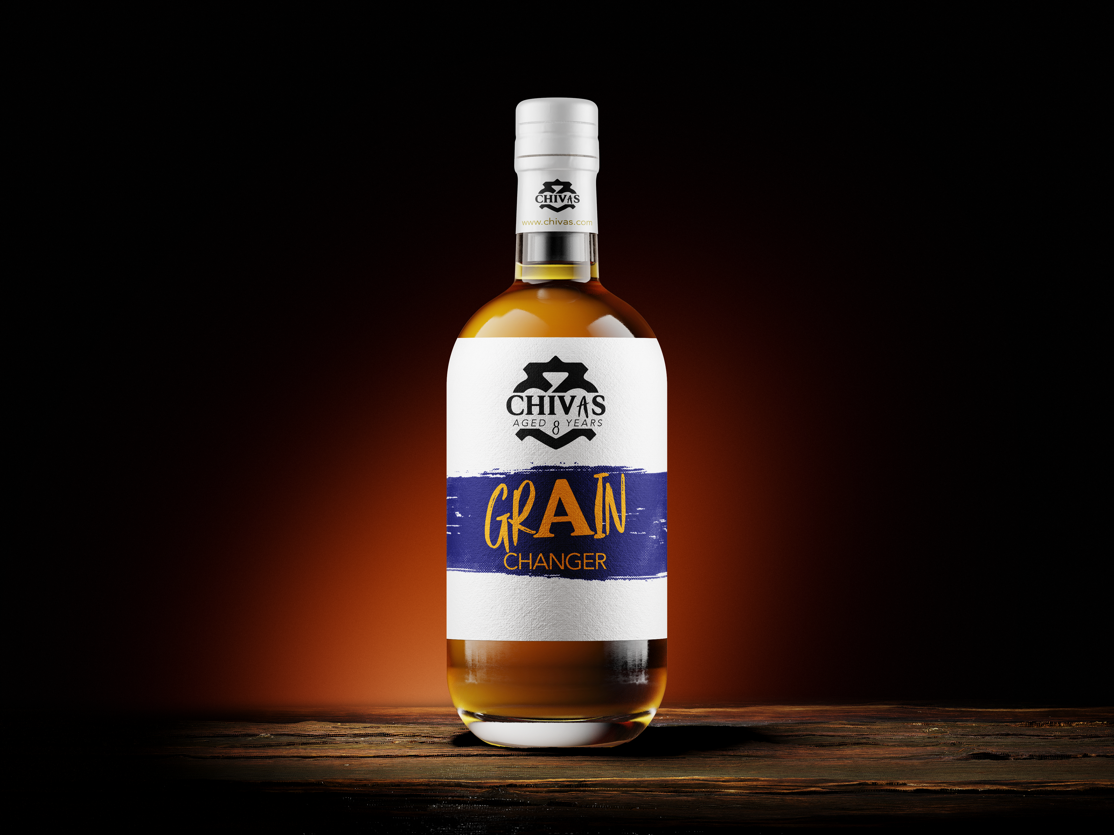
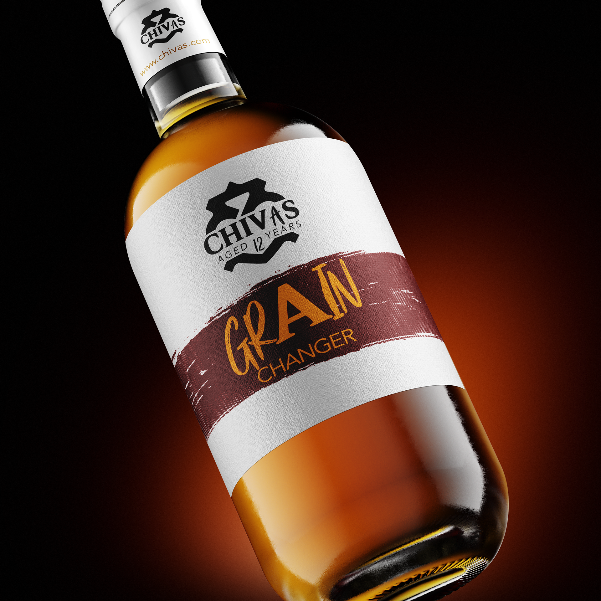
My message, Grain Changer.
Using different letters in the "CHIVAS" logo and "GRAIN". Whilst appealing to the new audience was critical. I thought to not leave the existing audience behind. The logo's "A" is new audience breaking through to CHIVAS long lasting selection of flavoured blended scotch whiskey.
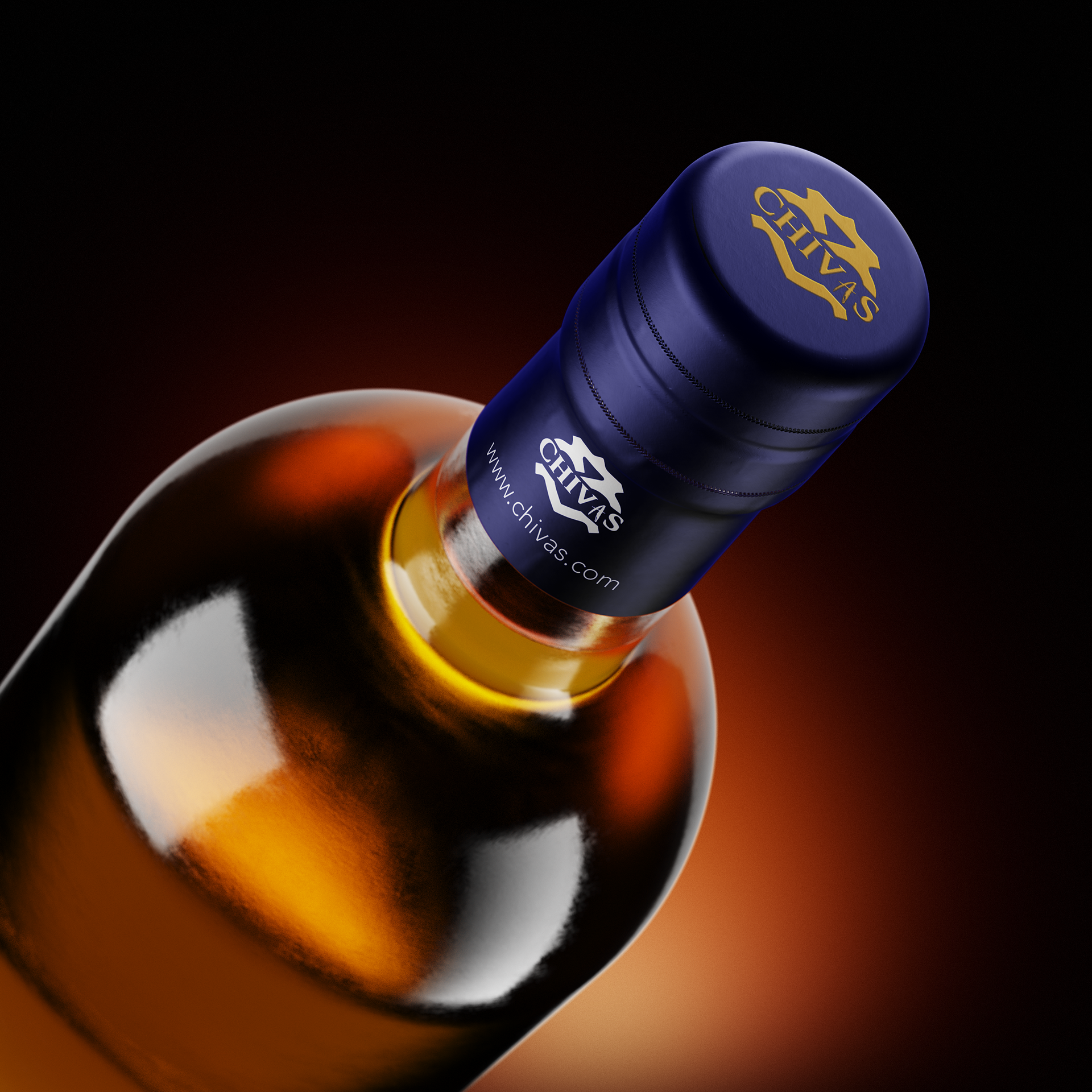
You can view more outcomes below.